A New Dashboard Experience
Context
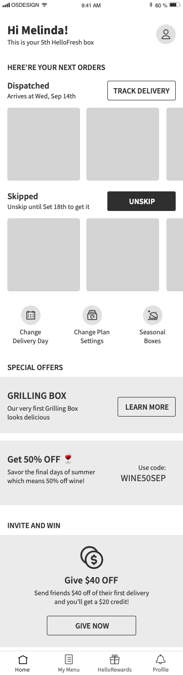
HelloFresh's digital platform allows customers to control their subscriptions, manage their weekly deliveries, and, most importantly, choose what's in their box.
Some product configurations are defined during checkout (box size, delivery information, payment method, and dietary preferences). HelloFresh pre-selects meals for the following weeks, but customers can return to the apps to modify those selections.
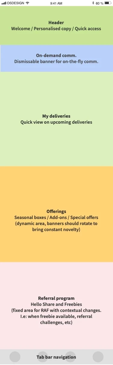
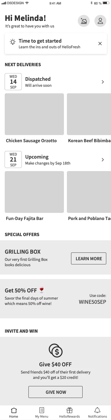
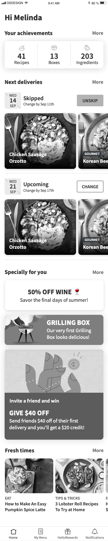
Our main goal was to redesign the previous dashboard and give customers a better summary of actions, offerings, and a glimpse of what's happening in their accounts (discounts, delivery notifications, etc.).
Our premise/problem statement:
"By providing a better navigation and information structure, customers would more easily find what they’re looking for and perform critical actions they want to do. In return, this would improve app engagement and connect customers to our brand, resulting in a higher cohort ROI."
Team composition
A nimble, senior cross-functional team was formed, bringing diverse expertise to accelerate ideation and execution. Regular updates ensured alignment with our key stakeholders, including VPs of Mobile and Product, Product Directors from Retention Tribes, Design leads, and specialists from various departments.
Research
We researched customers within the defined segmentation to answer the question, "What do customers want to see?". The supporting research questions were:
How well do our business goals align with our user's goals throughout the customer lifecycle?
- System: What potential actions CAN our users accomplish?
- User: What possible tasks do these users WANT to accomplish?
- Business: What possible tasks SHOULD our users perform?
How can we provide an experience to satisfy our users' needs throughout the customer life cycle?
Are they able to accomplish these actions Successfully, Quickly, and Happily?
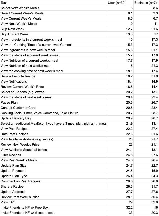
The UX Research team then interviewed several business stakeholders to gather their perceptions on actions that customers should perform within our platform. With that information in hand (in the form of a list of activities), they conducted a card-sorting exercise with customers.
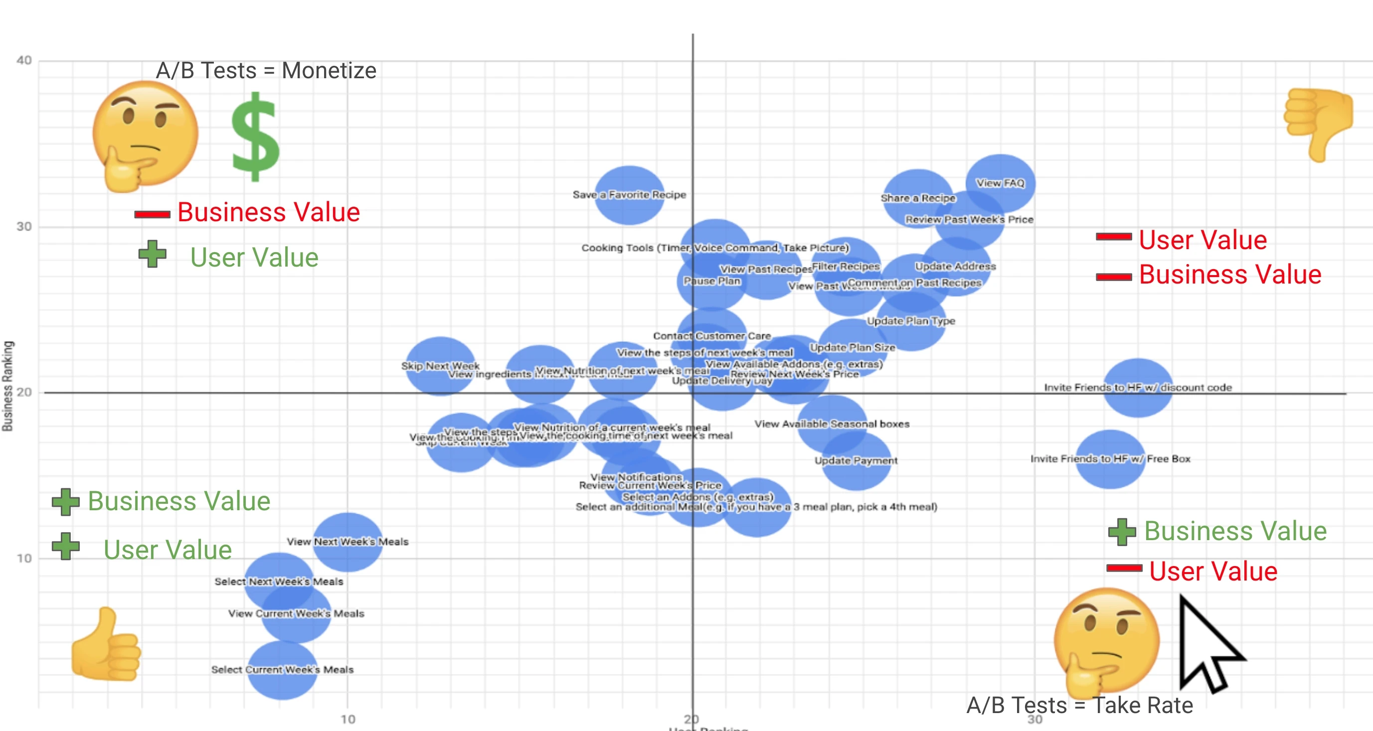
The third and last step was to plot the top actions — both business- and user-focused — into an impact matrix, guiding us on what to build.
Strategic approach
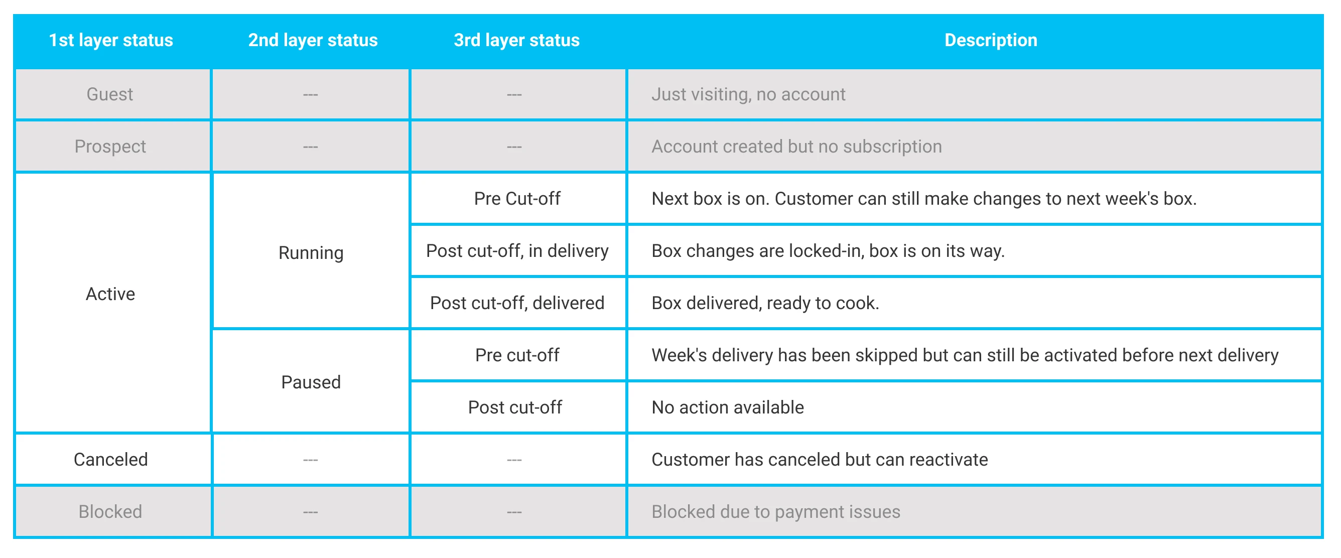
Operating outside the usual product team structures allowed for deeper exploration and iteration. We recognized the varied customer statuses within HelloFresh and designed the home screen to adapt to these different user states.
User segmentation
HelloFresh has different statuses and sub-statuses where customers can be at any time. A project requirement was adjusting the information on the home screen accordingly. To cater to the complexity, the designs must be based on flexible components that would be changed to the journey moment.
We decided to target Active and Canceled customers' segments for this experiment since they represented the most significant opportunity area.
Usability testing and iteration
An intensive usability testing phase yielded valuable insights. While users appreciated the new design's aesthetics, they expressed a need for greater familiarity and interaction simplicity. This feedback was key in refining our design. Some insights:
- Users preferred the new home screen's visuals and overall experience.
- Participants rated the usability of the old home screen higher than the new one which may be due to familiarity and learnability issues.
- Users liked the overview of weeks and could easily interact with them. They wanted to see more weeks on the new home screen
- Users could easily discover and interact with the banners on the home screen.
- We observed unintuitive interactions and discoverability issues.
A/B test
Since we were introducing many changes to the Home Screen, the approach was to run a test with a small percentage of our customers having the new designs as a variation and the old dashboard as the control version.
- Test duration: 3 months
- Cohort: ~350k active and canceled customers
A/B test results
- Home screen users canceled less but skipped more (also unskip more afterwards) leading to net zero direct impact
- Difference in monitored engagement metrics were minimal
- Home users send significantly more referrals leading to indirect positive financial impact
Roll-out
Encouraged by the test results, we expanded the new home screen across all 13 markets. This phase involved preparation, including translation into seven languages, guidelines for the new banner component, and final adjustments for platform-specific needs.
Conclusion
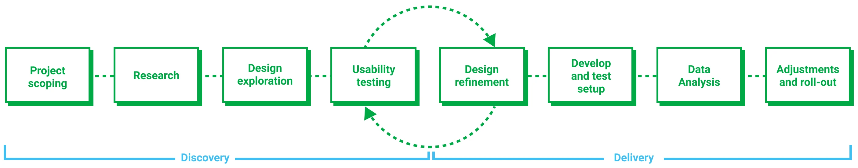
The Home Screen initiative had and intricate scope. It took us about 6 months from initial discussions and research to full roll-out.
It was exciting to have the chance to step away from the fast paced feature teams and explore the possibilities of a dashboard experience more freely.
As part of rolling this feature out, I've handed over this work to product domain's designers, allowing them to explore the space and develop it further. It was a satisfying process witnessing them improving their team's metrics due to the improved exposure in the front-facing app experience.
Learnings
The value of a centralized action point area
We managed to streamline our customers' experience on our mobile apps, and at the same time, we introduced new real estate for teams to promote deals, communicate with customers, and display critical actions such as skipping weeks or checking upcoming meal options.
The other benefits of this experimental project
One significant learning was that customers preferred a centralised and quick place to check upcoming meals and options. This sparked discussions about the app experience and prompted a research initiative for rethink HelloFresh's app interactions.
Although unintended, the new home screen opened a new world of possibilities and unblocked conversations around a more customer-centered approach, was it was a chance for Design to help product to think more holistically and move away (even for a while) from micro-optimisation work