Designing an Icon Family
One thing that I love about leading design is the chance that I get, now and then, to roll up my sleeves and help my team deliver projects. At Moonfare, I joined the company amid a big rebranding initiative. My responsibility as a team was to manage areas of the product touching the company's website and also the users' application. One of the central pieces for the rebrand was the website, which also happened to be the main source of business leads. As part of its site content structure, Moonfare relied heavily on icons to convey navigation and product offerings, and it was also a key asset for the newly launched investment training area, Private Equity 101.
The branding agency Barkas has delivered a brilliant, comprehensive brand guide, but there were only hints of directions concerning user interface. The job then was to use those directions to create a new icon family for the website and, later on, the internal applications. I led this initiative, connecting the agency, our internal brand lead, and the design system designer to prepare the icons for the big brand launch. The biggest constraint was time. We had only a few weeks to design 60+ icons and guidelines for the new icon set.
Research
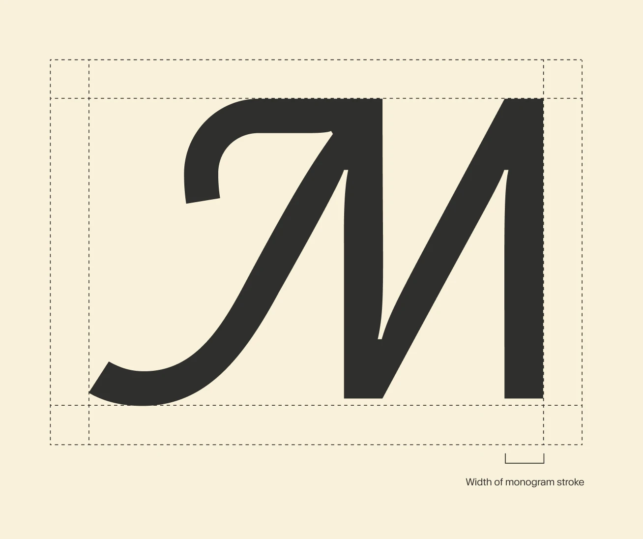
The research consisted in finding what visual features would meld the icons with the new brand. The new logo was the best piece to understand the geometry and patterns we needed to represent. The stylistic solution for us to connect the icons with Moonfare's new brand was defined as:
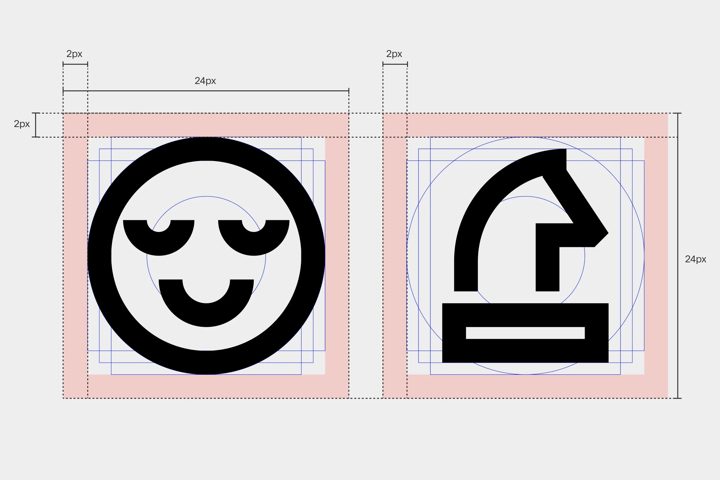
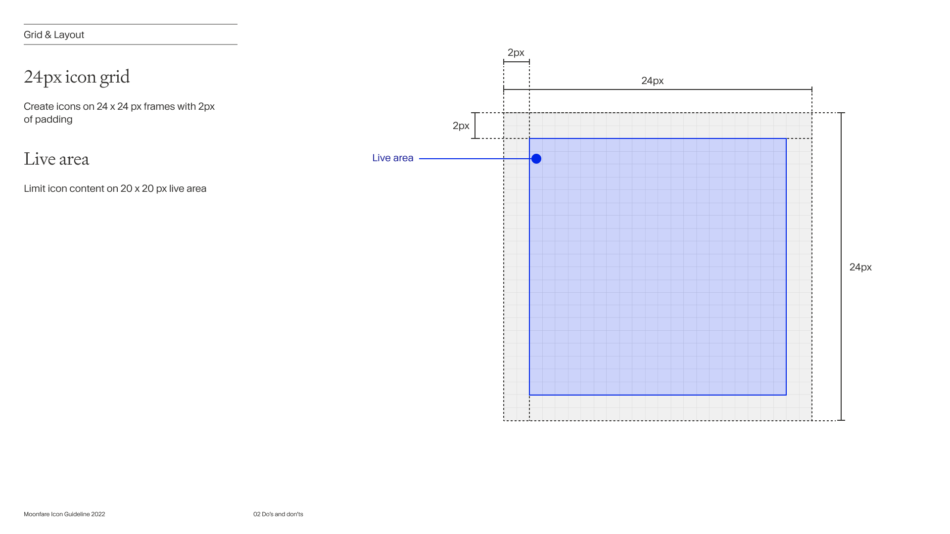
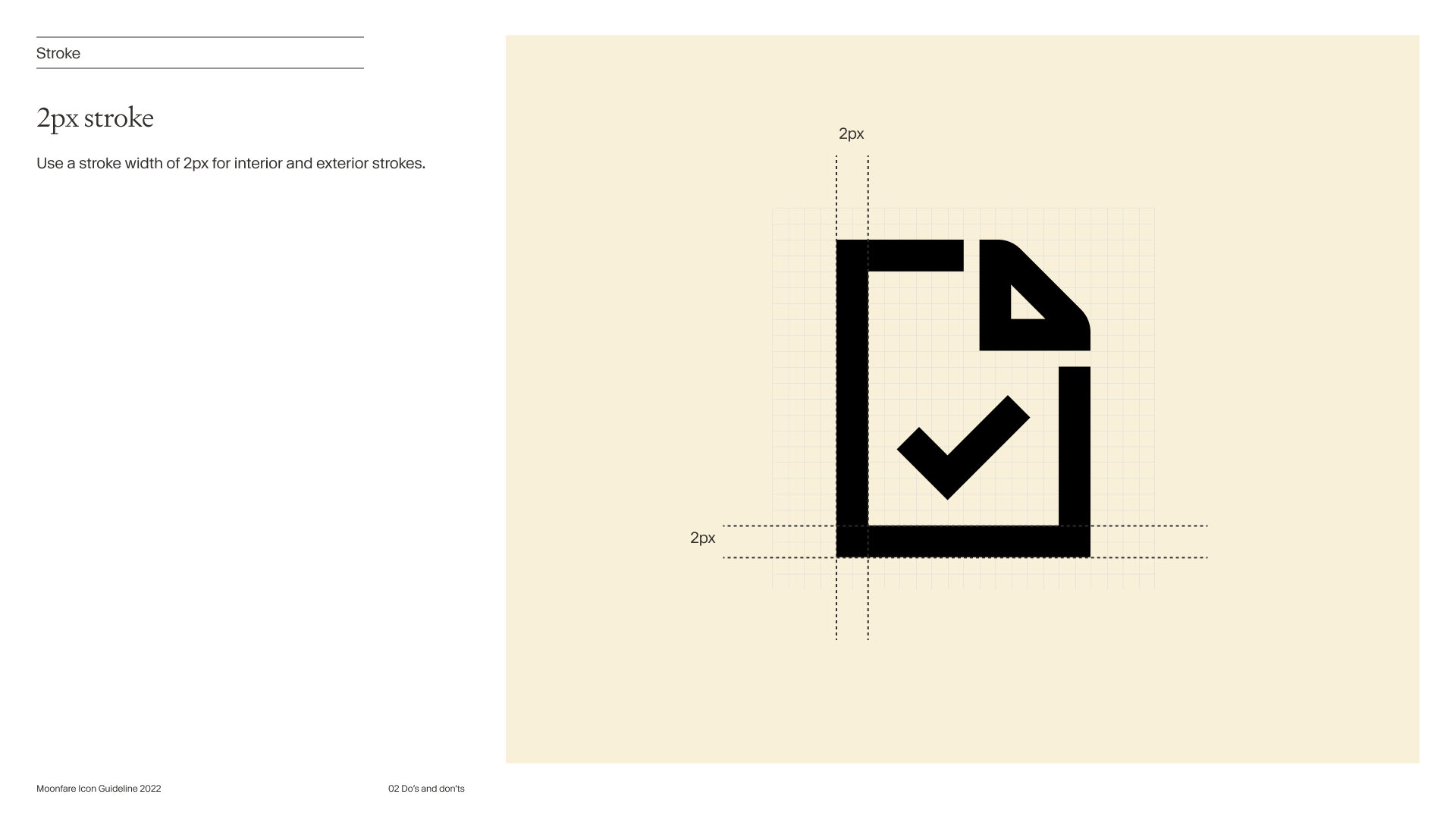
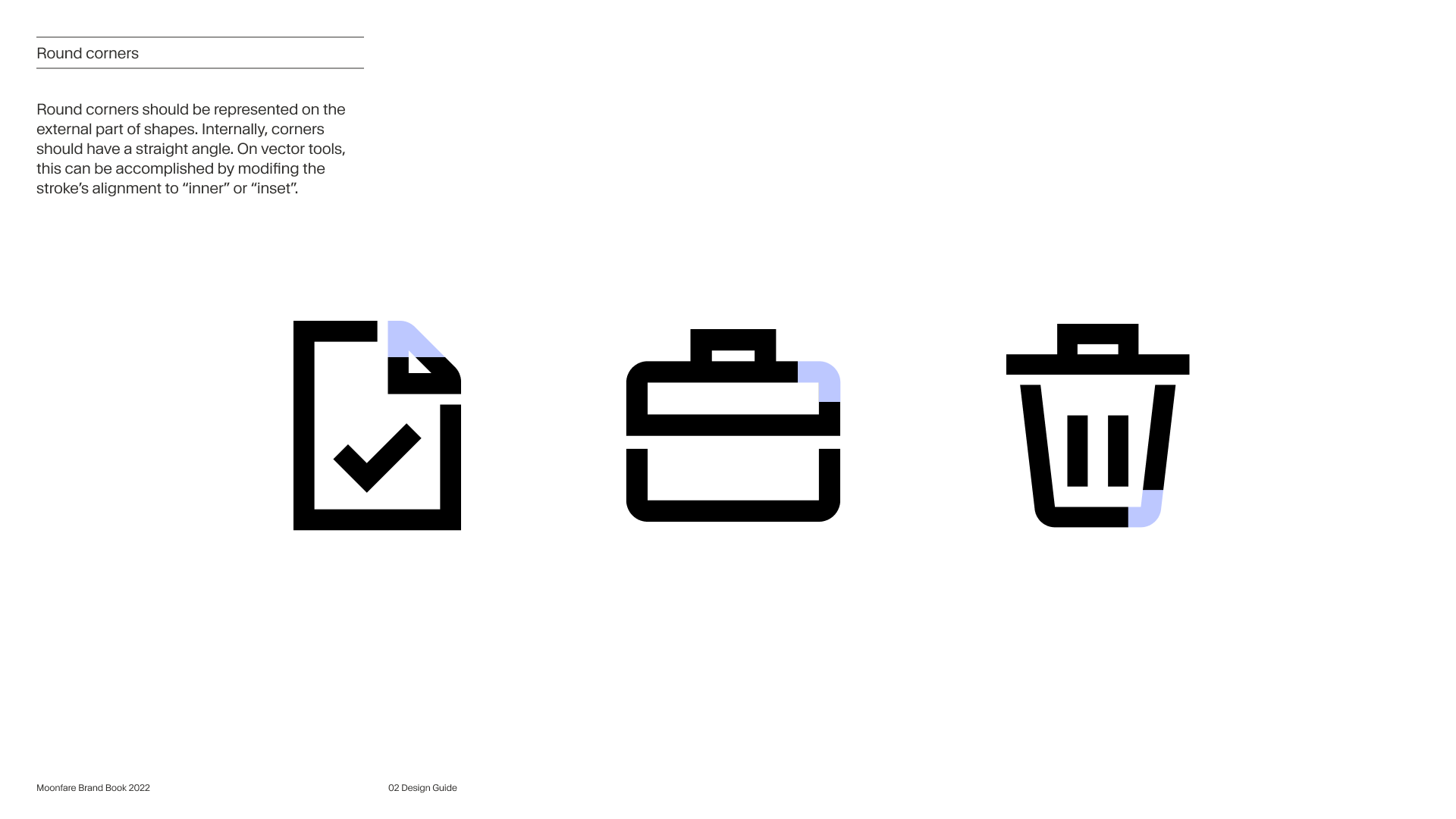
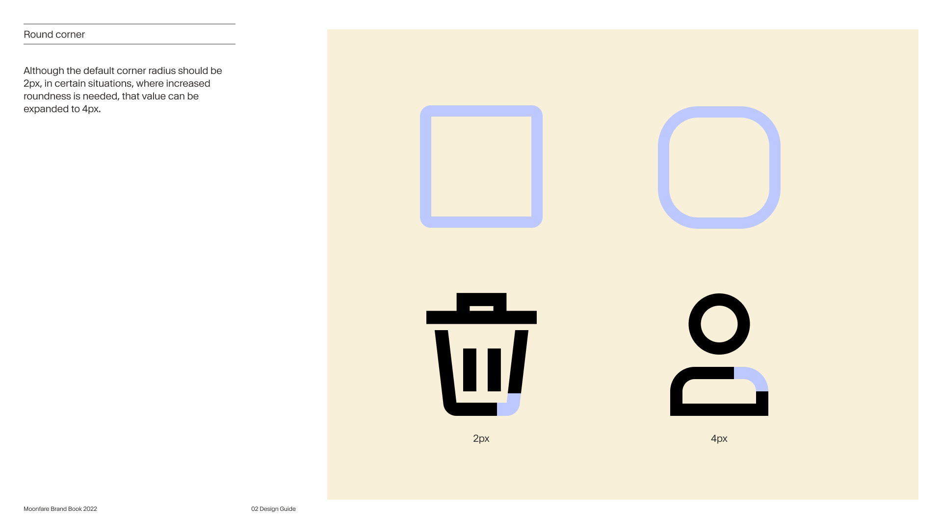
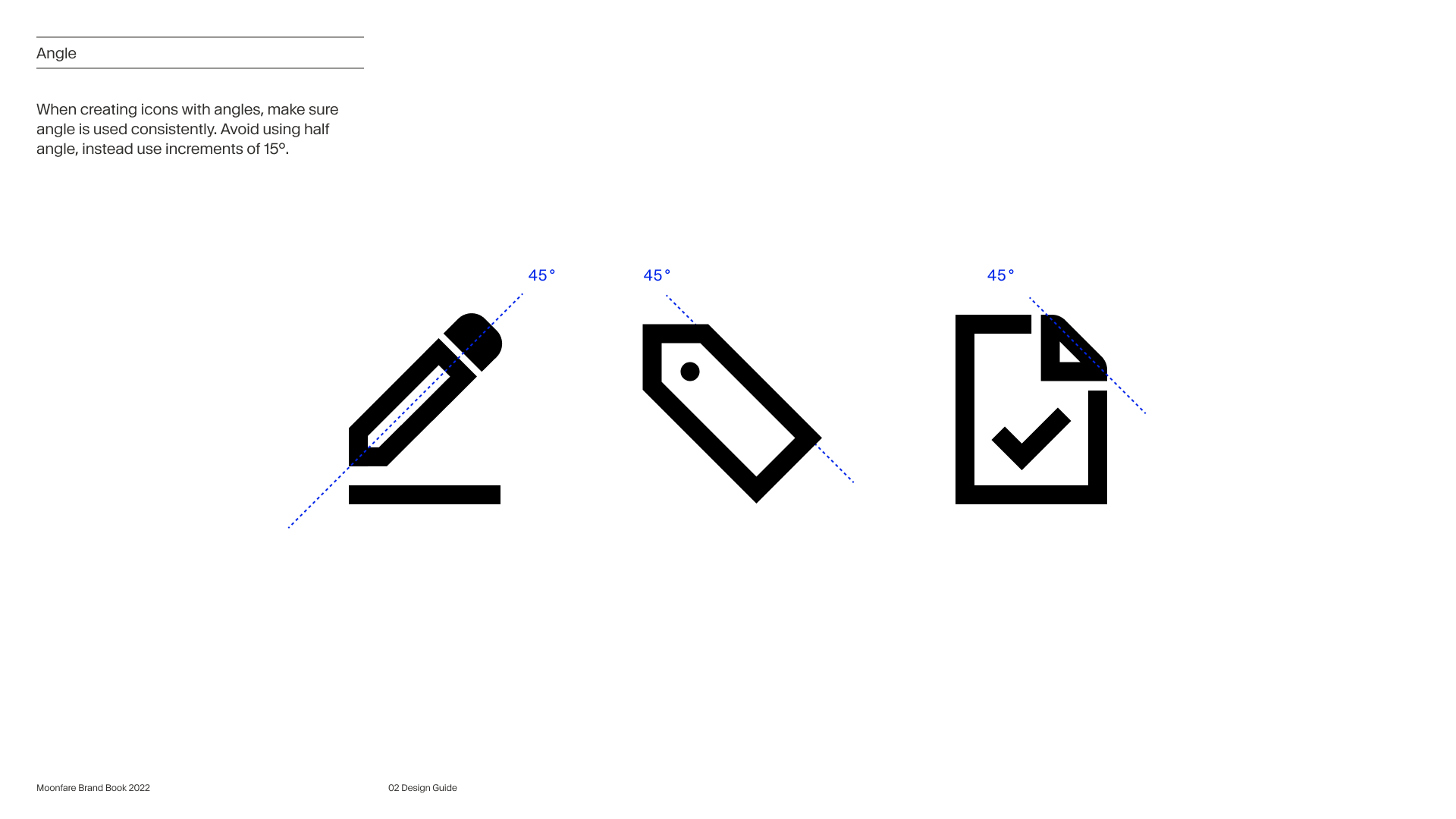
- A balance between sharp and round corners
- Thick borders to contrast with the minimal brand style
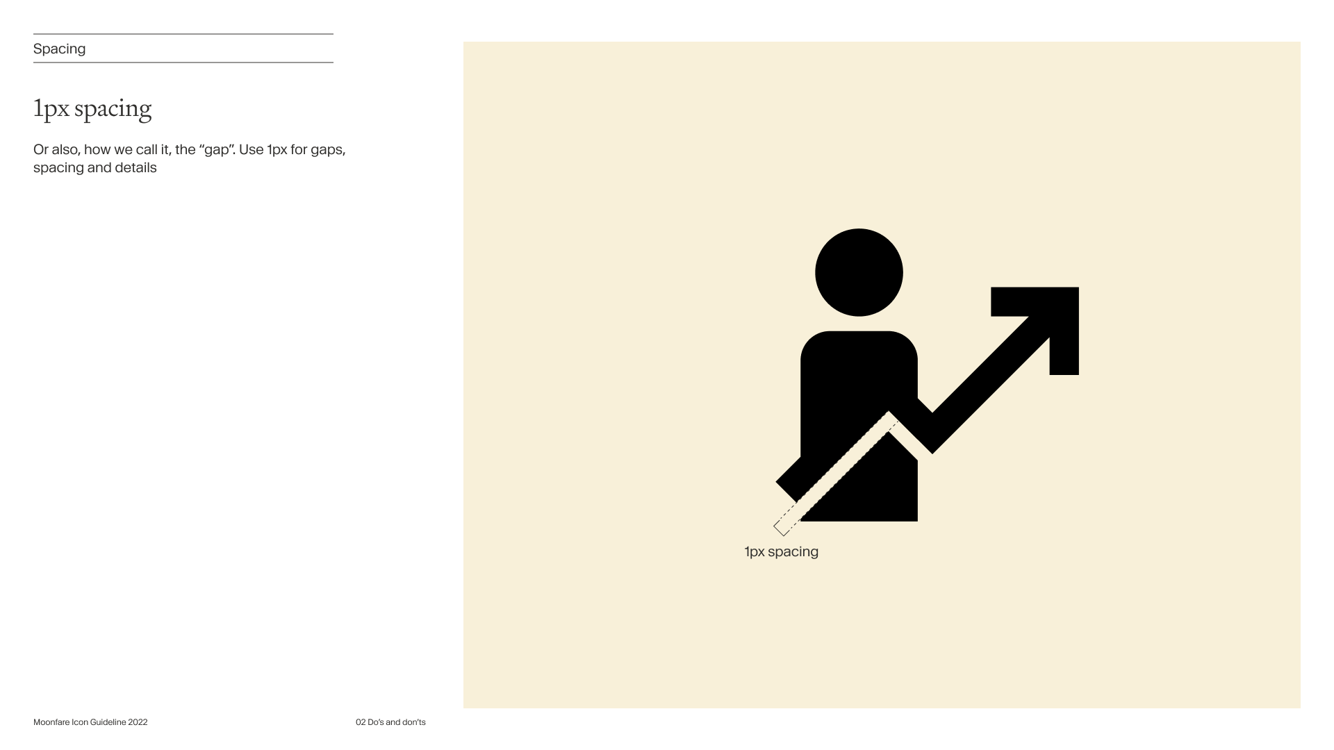
- Open gaps to create a sense of dimensionality
Icons allow complex concepts to be represented through simple forms. This feature was crucial for us since terms such as Funds, Fees, or Venture capital were among the abstract concepts that needed visual representation.
We tackled the abstraction by defining analogies and testing different ways to represent concepts. Very interactive live collaboration sessions accomplished that.
The Method
After compiling an inventory of icons, I split them into three groups and randomly distributed them between the brand director, the design system designer, and me. In our first session, we defined what characteristics would make the icons connect as a family and worked to create as many variations and styles as possible. What worked well for us was to run 2 to 3 hours of online pairing sessions. We played some music and kept our mics open as we worked. As soon as one of us had ideas and breakthroughs, we'd share it right away. That worked well, as we agreed on the stylistic direction and metaphors.
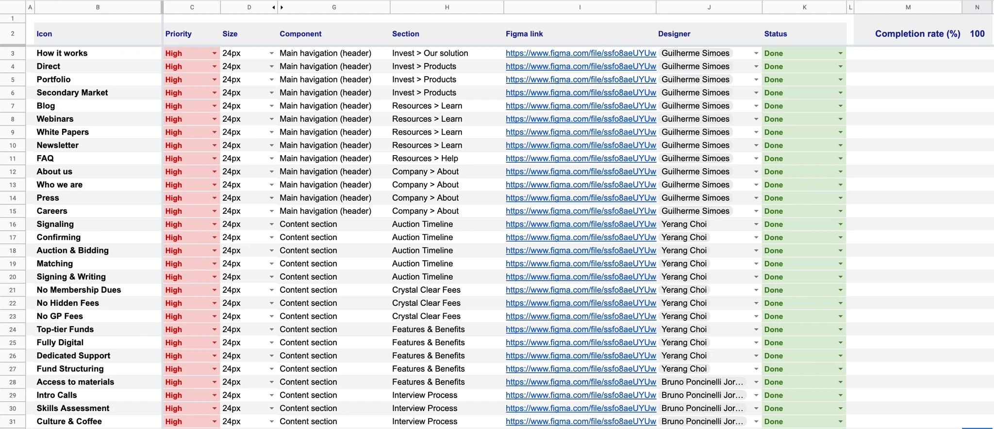
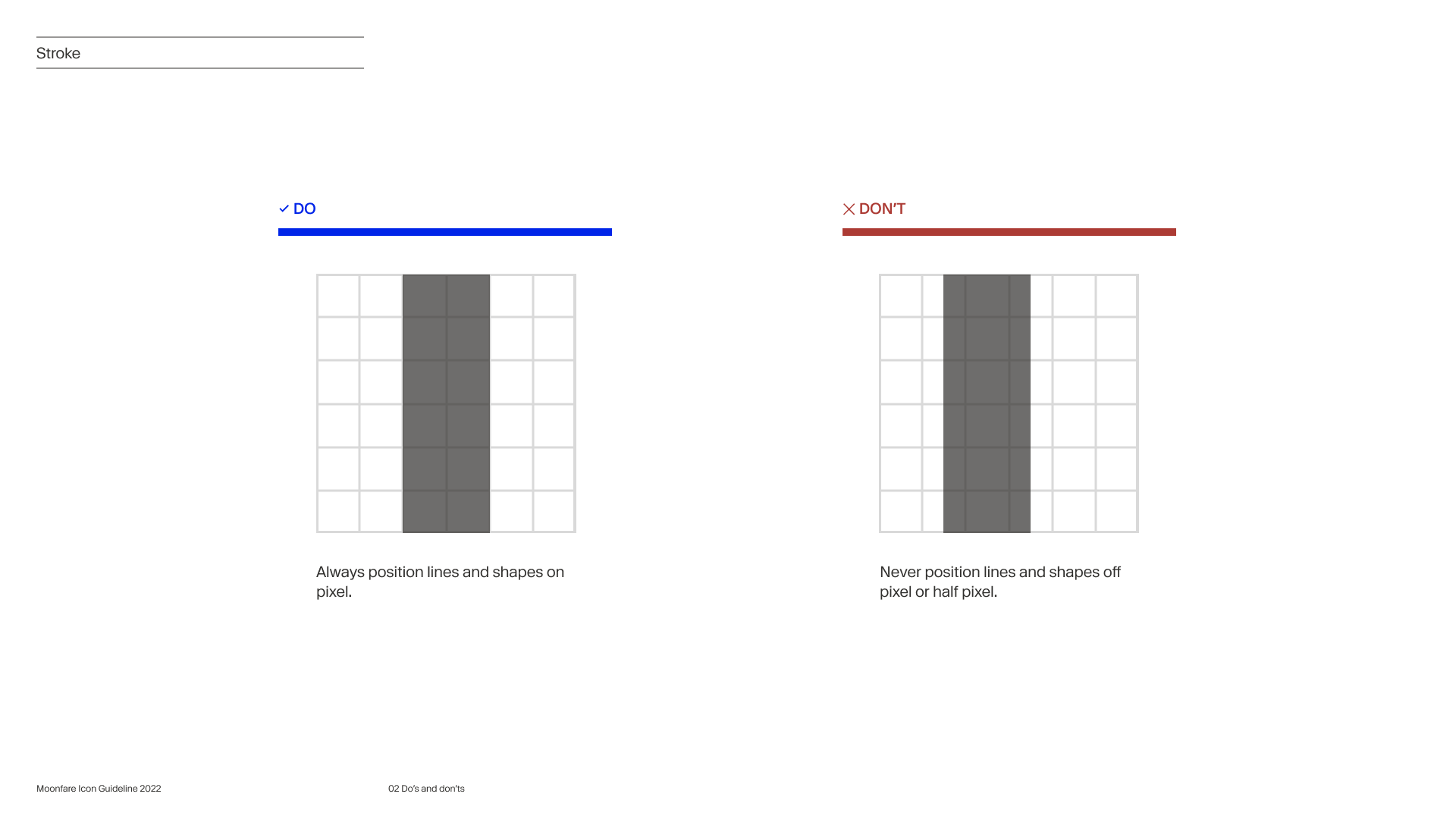
As the creative direction was defined, we went through labor-intensive work to create all icons within our assigned group. From our project spreadsheet, we could mark the progress by tagging icons through multiple statuses including ready to be reviewed. As the project lead, I was the owner of the definition of done and responsible for reviewing and making final adjustments to all icons to ensure consistency on a pixel level.
Conclusion
It took us three weeks to finish the work we committed to, from the first engagement with the brand agency to having all final icon assets. I was extremely proud of the pragmatic approach, collaborative process, empathy, and support our team showed along the way, but more importantly, the level of quality achieved by the team.
Icons are often outsourced pieces of work. There's a reason for it. It's simply hard work that design teams find it hard to justify the time and effort put into it and also the lack of internal experience in developing them. The importance of icons, though, shouldn't be taken for granted. They are an asset that bridges the gap between marketing and product, and they normally act in a stealth mode, supporting users' decisions, informing them of concepts, taking their attention to the right places, making their experience more accessible, and serving as an overall powerful visual aid. It's impressive how these little, often unnoticed, graphics are in every part of our daily lives; look around.
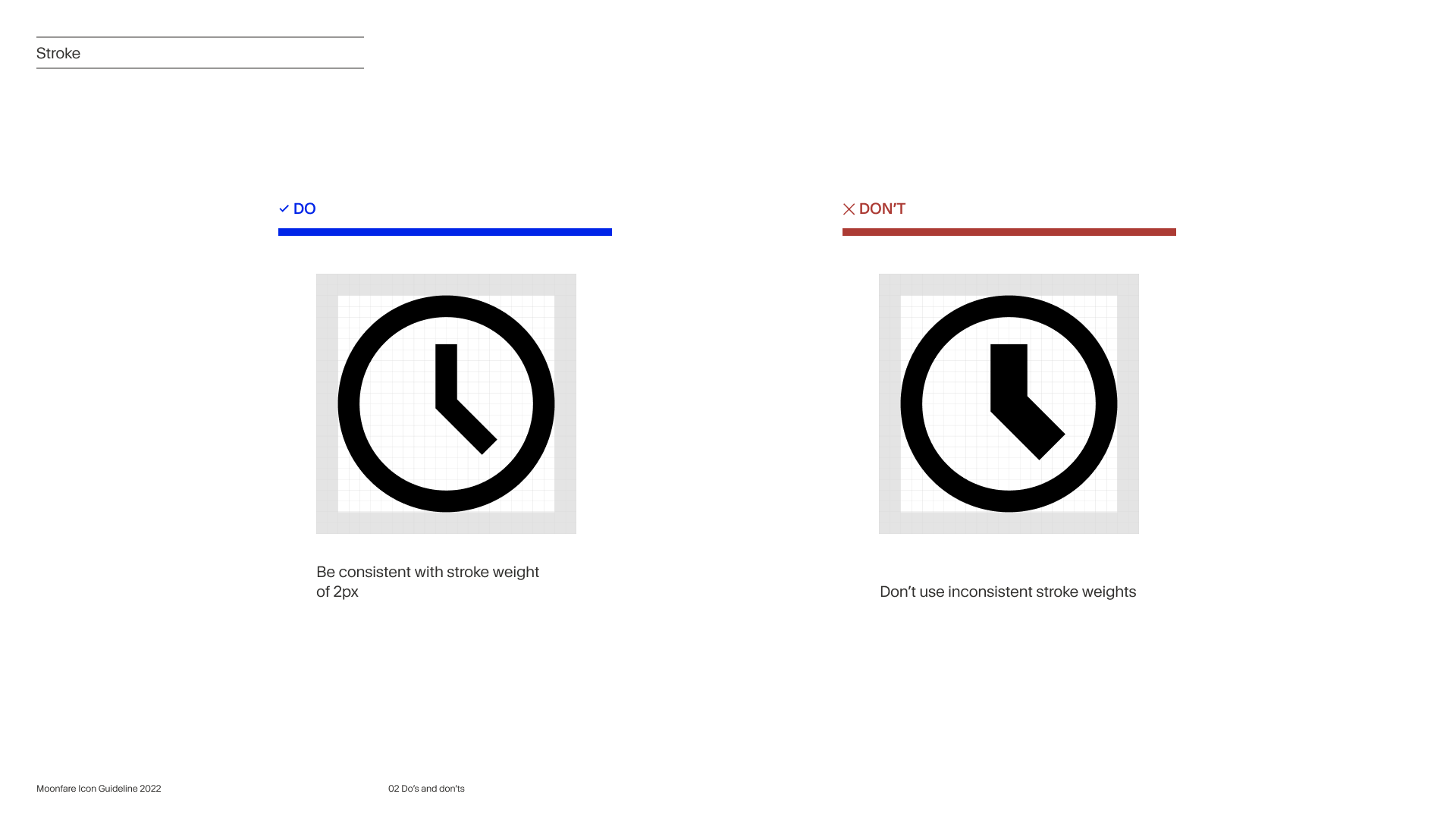
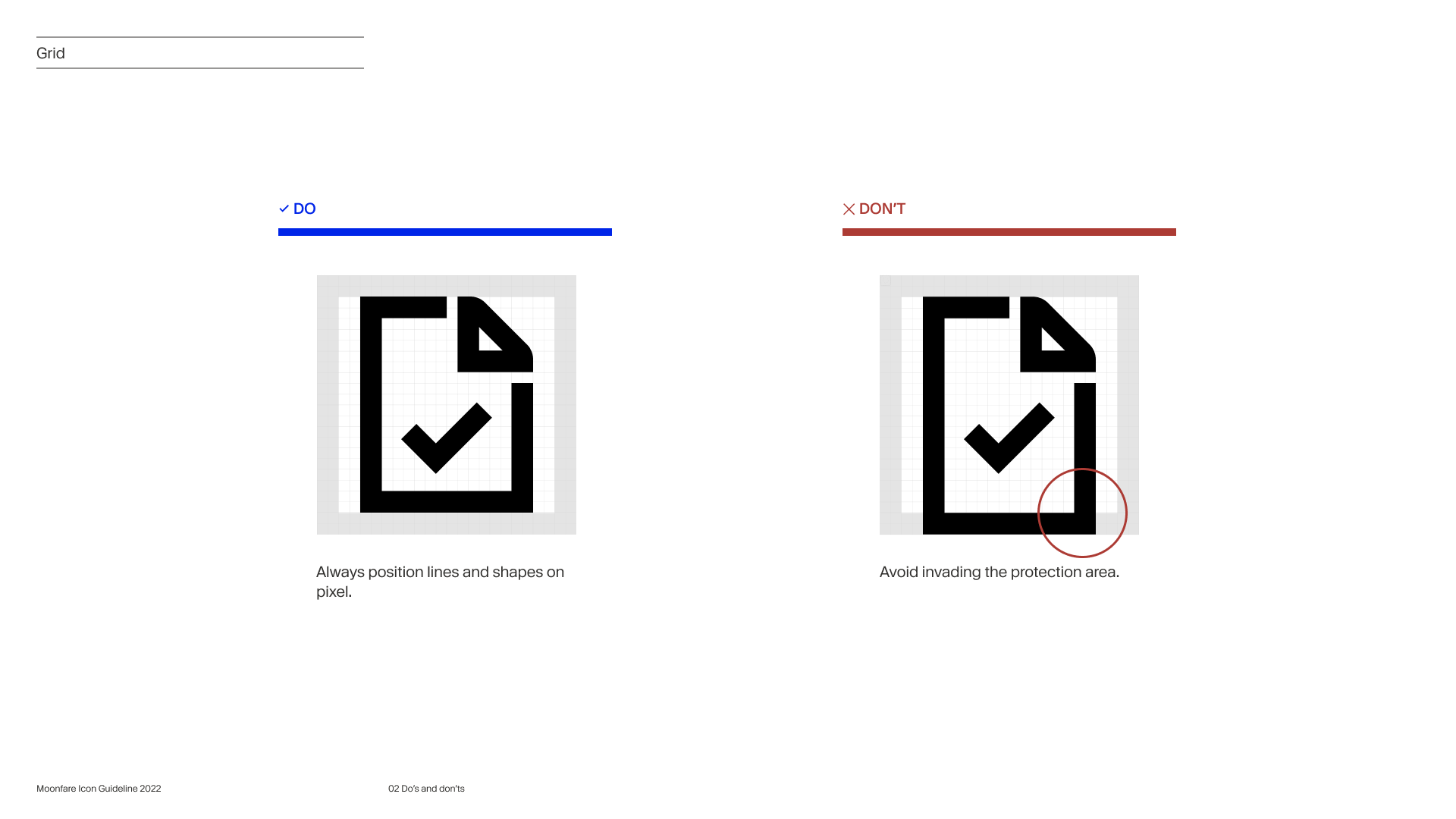
Guidelines
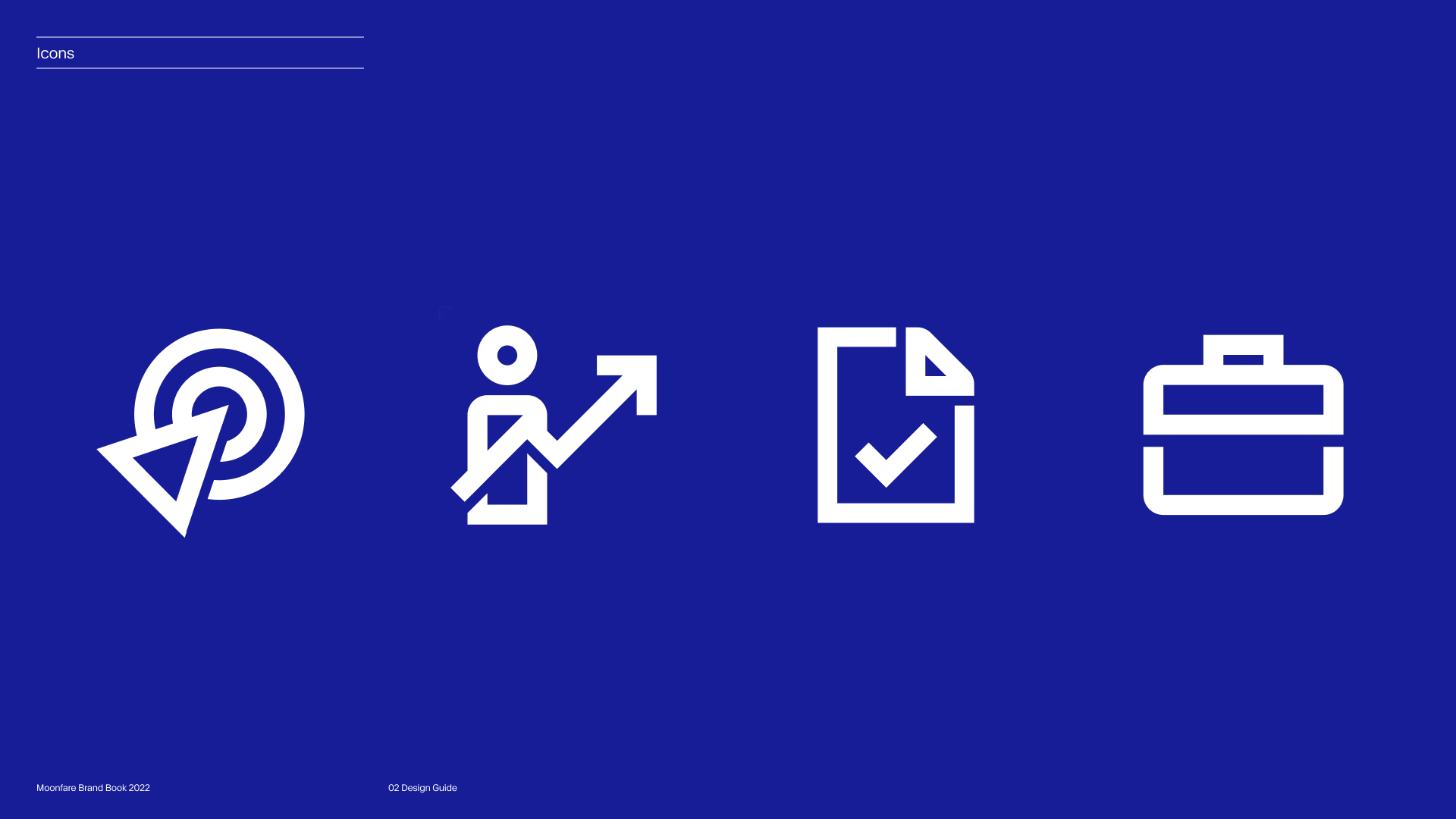

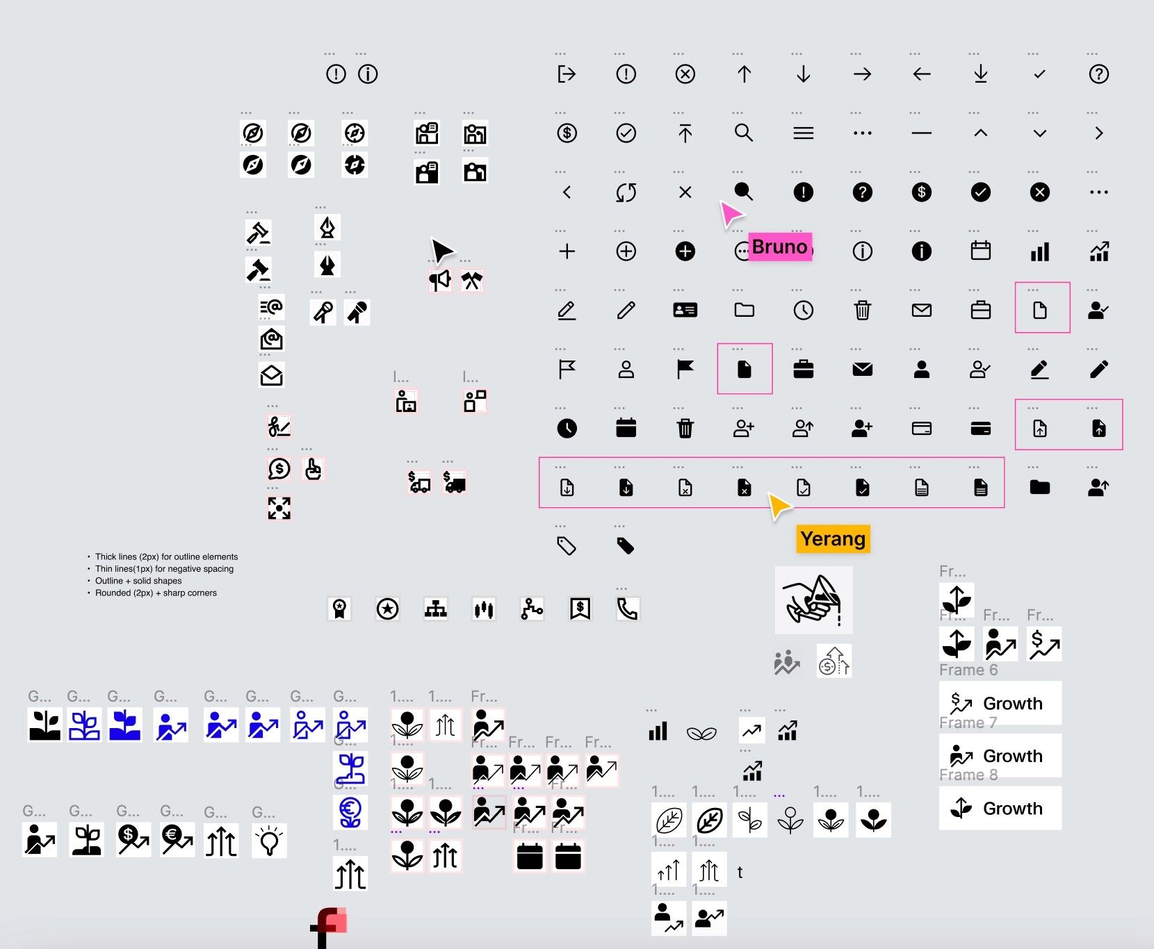
Final Icons